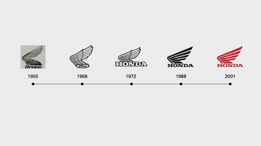


In case you’ve missed it, companies across the car industry have been quietly updating their brand logos with simpler looks and sleeker fonts.
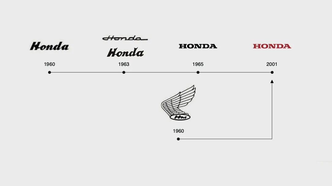
From Audi and BMW to Nissan and Toyota to Kia, Volkswagen and even Rolls-Royce, there’s been a clear shift towards single-color text-based designs. Even before Jaguar’s controversial rebrand, many automakers were making attempts to cultivate a more modern, digital-friendly look.

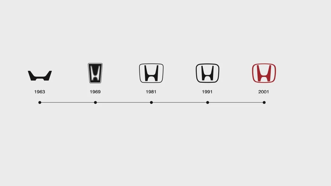
Honda is among the latest to join the party. Even though the company previously introduced the design of its updated H mark logo, there’s been a new development in how it’s set to be applied going forward.
An updated H mark for all autos
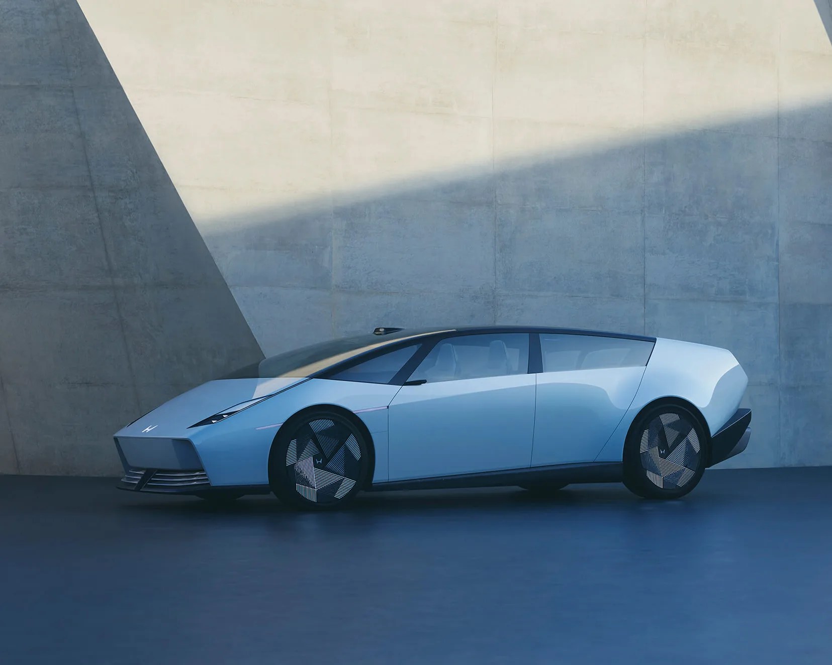
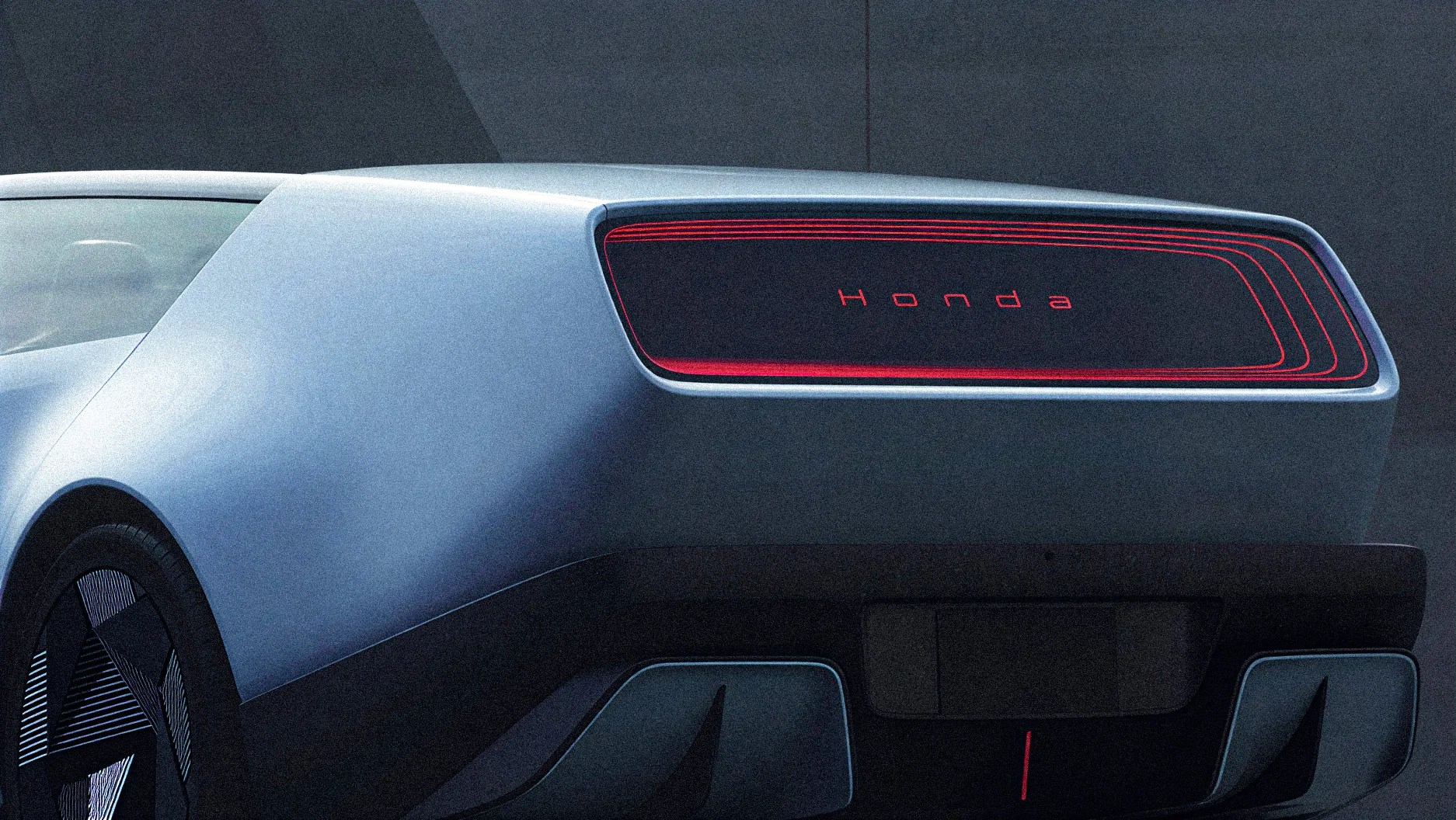
Honda originally debuted its refreshed H mark last year at CES in conjunction with the unveiling of the uber-futuristic 0 Series.