
Mark Braun isn’t a watch designer. Head to Braun’s website and you’ll find a portfolio filled with furniture, glassware, lighting fixtures and home goods for brands like Wallpaper*, Lobmeyr and Authentics, to name just a few. After training as a carpenter in Berlin, he attended the the University of Applied Sciences in Potsdamn and opened his product design studio in 2006. Braun’s products eventually caught the attention of German watchmaker NOMOS, who approached him to design what would eventually become the Metro Datum Gangreserve, our watch editor’s personal grail watch and the winner of a Red Dot Design Award, German Design Award and GOOD Design Award (we’ll let you decide which carries the most weight). We recently had an opportunity to sit down with Braun and asked him about the transition into watch design, his inspiration and the finer details of his designs.
Q: What were you doing before working with NOMOS, and how did you get involved with the brand?
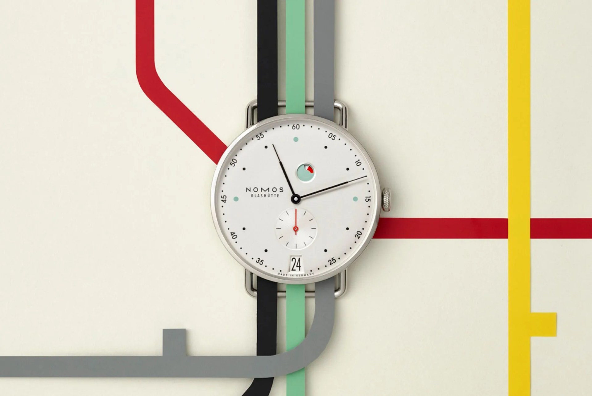
A: I designed a collection of whiskey glasses, and the creative head of NOMOS read about them and wanted to work with me. I was asked to pitch some watch designs. It was like I could design whatever watch I liked. One was the Metro. Luckily it fit with the tastes of both the owner of the company (Roland Schwertner) and I… It’s not always like that, especially when you’re a freelance designer.
I was quite lucky in that I offered them four designs and they really liked three of them — that’s a good amount to have go to the next level in the design phase. But the Metro ended up having the best aesthetic for the brand: a very thin case with the right amount of visual complexity in the dial.
Q: Were there some designs that you were sad to see not work out?
A: With the watch case, no. Everything worked well and there was no need to compromise. But with the dials I had four different designs. I had one with SuperLuminova, but this wouldn’t work because [the watch] would have had to be thicker. I had another design I liked that was quite minimalistic, but to be honest, when I see it now it does not have the same power or complexity as [the Metro].
Q: What were your inspirations?
A: My wife is a graphic designer. We were both outsiders [to the watch industry] and we sat together and came up with the basic concept of the dial. She has lots of experience with graphics, and I love working with different instruments and how they show measurements. I also love vintage watches in old auction catalogs. It’s very interesting, only if you translate the archetypes [of vintage watches], otherwise there’s a danger of just copying vintage designs. Understanding watch history is important, so it’s a mix of the heritage of watch designs in general and of finding new influences.
Q: Were you able to use some of your traditional training in creating a watch design?
A: In the beginning, I made plaster watch prototypes because I was trained in that. But to get to the next level, I had to improve my skills on the computer, with CAD programs.