Doxa is one of the most famous makers of dive watches in the world, and the most distinguishing feature of its watches is their brightly colored dials.
The original Doxa Sub 300 from the 1960s debuted with a bright orange “Professional” dial, with the idea that it would be more visible underwater. Unfortunately, orange is one of the first colors to disappear as you descend underwater, but the color stuck around anyway, and has since been joined by the similarly bright “Divingstar” yellow and “Aquamarine” turquoise as the most recognizable shades in Doxa’s core collection of divers.
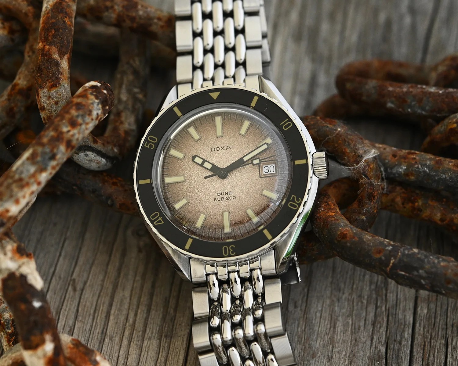
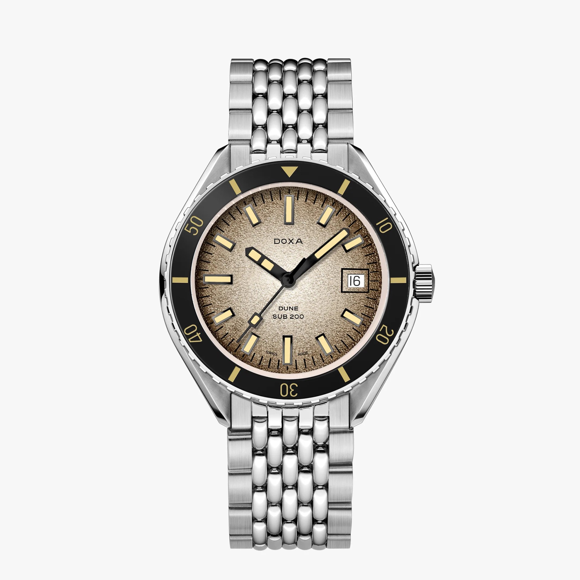
But how would a Doxa dive watch look with a dull-colored dial and a bit of added texture? As it turns out, it’s pretty spectacular, as the new Doxa Sub 200 Dune proves.
Sands of time
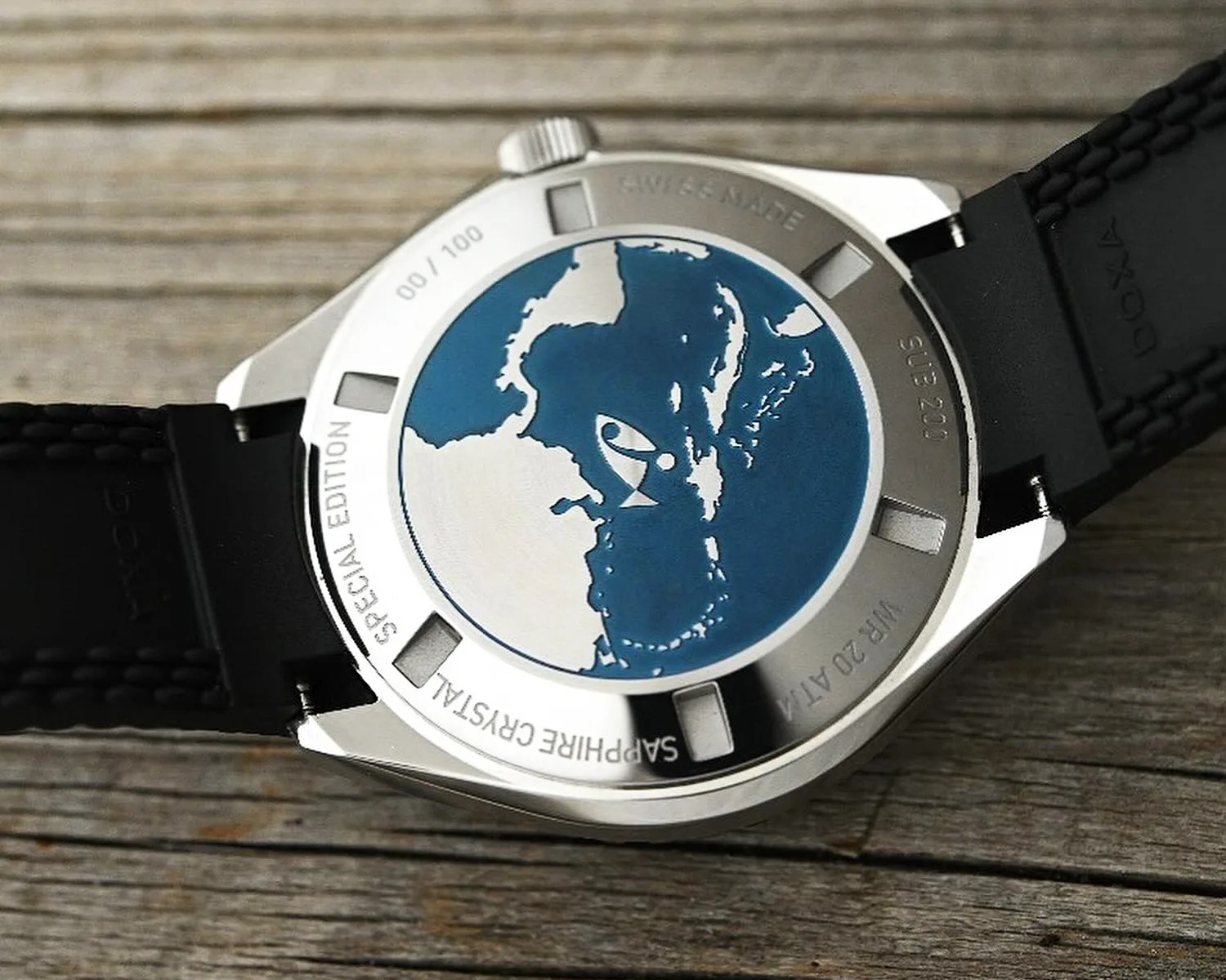
The new Doxa is a collaboration between the Swiss watchmaker and St. Maarten-based retailer Art of Time. The idea behind the Dune was to capture the feeling of being on a Caribbean beach with the sand-inspired dial, and I’d say they’ve done just that.

The dial has an interesting sand-grain texture — nothing I haven’t seen before, but I tend to like the style. And while brown dials can be tricky to pull off, Doxa did a nice job here by making the dial gradient. It’s light in the center and darker on the edges, which makes the dial more vibrant and active to better represent the “windswept dunes under a tropical sun” look that Art of Time was aiming for.


